About Our Logo
Here’s the story behind the design of the website’s logo.
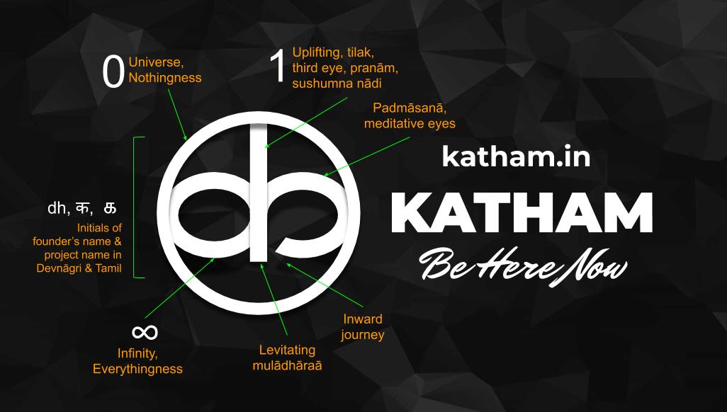
Katham’s simple logo is designed to easily disseminate the core objective of the project to our valued readers, i.e. virtual yatras inside ourselves and living the truth in the present. One has an unlimited (infinite) power of imagination, which should not sully the perception of reality. Thus one ought to peek inwards, seeking answers therein & this is feasible only if one is inquisitive.
The design of the logo originates from the initials ‘DH’ of the founder of this project, Prof. Dineshkumar Harursampath, taken in lower case ‘dh’. After extensive study and survey for one month, the project got its name “Katham” (a sanskrit word, meaning how?). Now, the next step was to combine ‘dh’ with the first letter 'K' of the project name which could be done beautifully by taking क in devnagari. क is also the first consonant in the Devnāgri script and its sound arises from the depth of the throat. க is ‘ka’ in Thamizh. Interestingly, this is the only letter which has almost same script in Devnagri, unifying south & north!
The writings by Prof. Harursampath cover various aspects of our life and show correlation among nothingness (0) - universe & uniformity, everythingness (∞) and self-only (1). Hence, the three aspects were essential to be incorporated in the logo, which again was done by simply taking 0 in as the outer circle, ∞ by modifying 'dh/क' with a break (looking inside), and 1 by the center vertical line lifted, thus, symbolically receiving universal blessings. The tail of the क is folded inside but without touching the center vertical line, a symbolic representation of looking inside, or inward yatras, a major theme of the project.
Draft construction of the logo itself showed a simple & sublime design with multiple connotations: dh/क with the circle (0) forms a divine meditating face made with two eyes and a tilak (centerline), same set showing a yogi in padmasana (∞), under upliftment through his/her vertical spine (centerline). By abstract design itself, the logo takes a few minutes for new visitors to interpret it inquisitively.
To validate the logo design, Prof. Harursampath took a novel initiative by calling for a “logo demystification challenge” directly on the website itself through his post dated July 22nd, 2020. This call got an enormous response , beyond expectations. The feedback matched and surpassed the ideas of the logo designer, thus validating the design. In the next post, the awardees names were also announced.
A real yatra is supposed to be an inward journey within us as the only way out is in! That’s virtual yatras aplenty in katham.in.
Read more...